Project 1
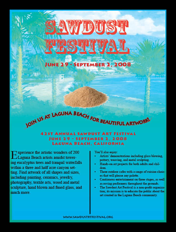
Sawdust Poster
Justification
Justification
My poster was confusing to create since I didn’t know all of the Indesign tools and how to use them by heart. I don’t have much experience with Indesign, and I don’t have very good creativity or imagination when it comes to artistic and designed things. However, I put a lot of time and effort into this project trying to figure out what looks alright and what should be changed. I incorporated many of the Indesign elements into my project and based it partly on the Ravenel Bridge exercise that we did in class. My poster incorporates many of the useful Indesign strategies that I learned from the first couple chapters. I blended the blue/green beach outline into the background to give it a festive style based on Laguna Beach, California. I made the beach picture and the borders match in color and using the 2 color swatch and varying degrees of transparency and tints. I used the pen tool to make curves for some of the text and incorporated unique font styles into my poster. Furthermore I used the paragraph styles to change the spacing in between the text and make the text more uniform and correlate better. I used the bullets to organize one side of the text that was a type of list. I tried to use the important design principles of contrast, repetition, alignment, and proximity to make my poster more appealing. Also, I incorporated the sawdust picture as part of the theme for the sawdust festival. I made the title stand out the most because it was the whole purpose of the poster to advertise the Sawdust festival.
Project 2
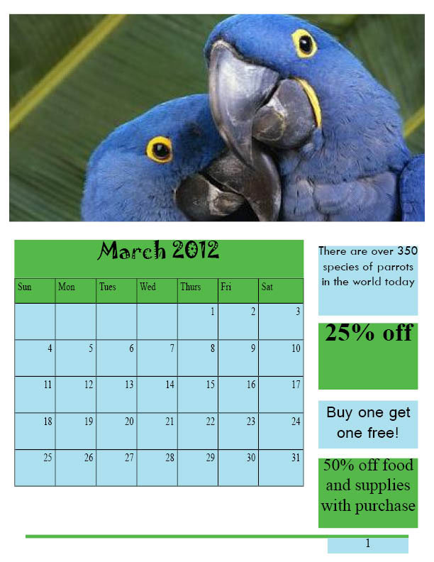
Humane Society Calendar
Justification
The Humane Society calendar was an interesting project to work on. I worked diligently to make this project creative and appealing to the audience who will want to purchase or adopt a pet. The people who see this advertisement will fall in love with the animals and only want to play with them or take them home. My design gives the impression that the Humane Society is a genuine organization that only wants to give each animal to a caring owner and a nice home. I incorporated the calendars into my project for each one of the three months and aligned them and made them look uniform. I used the insert table tool in Indesign. With the titles of the months I used unique and creative text for each one. Furthermore, I pasted pictures of cute and cuddly animals that would make great pets into the project that would catch anyone’s attention. I used the direct selection tool to fit the objects proportionally into the rectangles. For the coupons I made them stand out with different sized texts and bigger bolder fonts. I used a unique fun fact from the internet about each type of animal. I used the master pages to make the outline of each month’s page similar by putting the same outline into each page. I also used the insert page numbers at the bottom of the page to create the page number for each consecutive page. The master pages helped out so that I didn’t have to create each page separately by hand.
Project 3
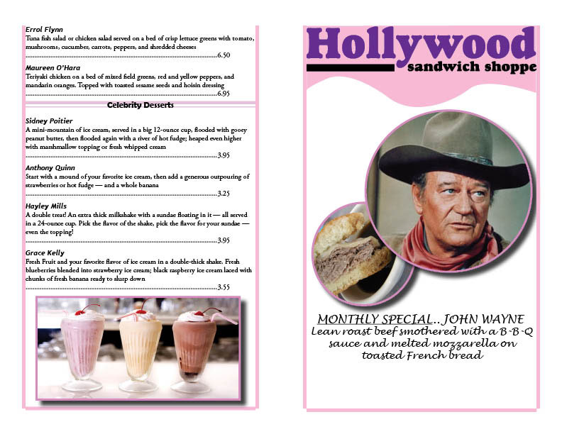
Sandwich Shoppe Menu
Justification
The Hollywood Sandwich Shoppe menu was fun and entertaining to create on Indesign. I used the little creativity that I have to design this menu and make it appealing to whoever wants to eat at the Hollywood Sandwich Shoppe. I tried to use a lot of the Indesign elements taught in chapter 4 and to also incorporate elements from previous chapters. In this project I added on designs and styles in order to tweak the Hollywood logo and text that was already given and turn it into my own design. I used the John Wayne sandwich as the special feature and created pictures of him and a roast beef sandwich that looks similar to the John Wayne sandwich. I also added a picture of some delicious milkshakes that are some of the Hollywood Sandwich Shoppes signature desserts. I incorporated some object styles to these images to add a stroke and a drop shadow and make them more appealing. I used the pen tool to create the background behind the menu title and added lines around the borders of the pages. Furthermore, I used the paragraph styles to create 3 different designs for the text and the headings of the menu text. The headings had rule below with a color in order to highlight them and catch the customer’s attention. I created a tabs paragraph style to incorporate tabs into the prices and monthly special title like we learned in class. These are the many Indesign elements that I used for the Hollywood Sandwich Shoppe menu so that customers will keep coming back to eat there.